
← All work
Case study · Brand identity · CrossFit gym
CrossFit The Way
A logo suite and brand guide for CrossFit The Way. The geometric W, cut with a gold chevron, works as a full lockup on the gym wall, a badge on a shirt and a simple icon on an app or a water bottle.
- Client
- CrossFit The Way
- Services
- Logo suite, brand guidelines, color palette, apparel
Logo suite
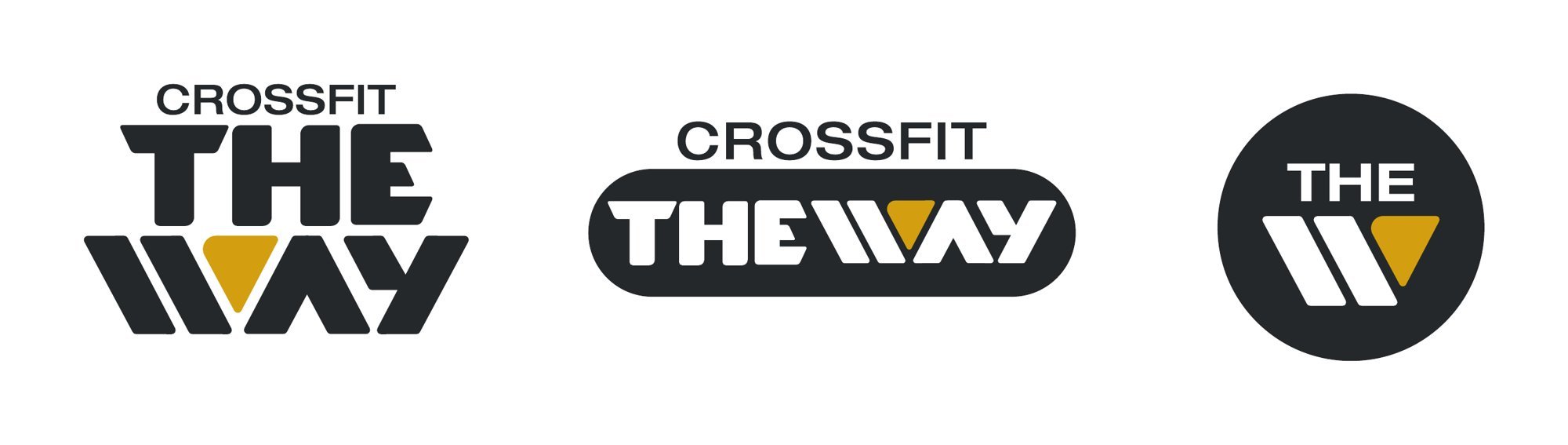
One mark, three ways
A stacked primary logo, a horizontal lockup and a round icon, all built from the same letterforms.
Color
Strong and grounded
A primary palette of black, gold and egg shell, supported by dark blue and cement grey, with Pantone, CMYK and web values in the guide.
BlackPantone 426 C · #25282A
GoldPantone 7555 C · #D19F2A
Egg ShellPantone 7527 C · #D7D1C4
Dark BluePantone 289 C · #0C2340
Cement GreyPantone 422 C · #9EA2A2
In the gym
Worn on the floor
The brand on the people who run the box.